Friday, February 27, 2009

Day 608's pretty


Everyone is talking about Dash & Albert lately. Probably because they're now offering the option to order cotton woven, wool hooked and polypropylene rugs online, as noted by Courtney at Style Court. And when Amanda posted this (above) image of this rug, it stopped me dead in my tracks. Too bad I just had a birthday; this would look great in our bedroom -- we could really use a rug in there, and some pattern, for that matter. Well, a girl can dream!

Happy Weekend!

Thursday, February 26, 2009

Day 607: door details


Thanks for all of the compliments on our front door project. It really was fun (as much fun as DIY home improvements can be!) and we're pleased to have finally gotten it done. Well, done is relative -- there are still a couple of things I'd like to do.

Ann Ever asked if we'd considered adding a door knocker, and yes, actually, the first thing I did when I saw Keller Donovan's gorgeous one was check the inventory at MyKnobs.com. I found a pretty version from Omnia, but wasn't expecting the $100 price tag. Ouch. It'll go on the wish list, for now.

I'd also kind of like a kick plate, just to dress the door up a little. It'd be nice for practical reasons too (like pups who impatiently paw at the door when they want to come inside).

Star noticed that both of our inspiration doors had topiaries on either side, and asked if we planned to do the same. We have had two footed pots on the porch in the past. You may remember that Maddie pulled everything out of them this summer, and I had yellow mums in them in the fall. I would like to put them back out, and now that Maddie's contained in the new backyard fence, what ever we plant will be safe.

Many of you seem interested in our little column project -- are you in similar situations? We've definitely tossed some ideas around and consulted with Wes' dad, who is a construction guru, now it's just a matter of getting down to it. And, of course, funding it, though we don't plan to spend much (fingers crossed on that one).


And finally, Amanda asked about choosing a front door color for her red brick rancher. I'm no color expert (in fact, I fully admit that landing on Cafe on the Riviera was a matter of divine intervention!), so my best advice is to try a few things out. The good thing about this project is that it doesn't have to be much of a commitment of time or money. If it doesn't work the first time it can be easily changed.

One thing I like to do for inspiration is take Saturday walks through pretty neighborhoods, and we've got a quite a neighborhood online, too. So, let's help Amanda out! What color is your front door?

(Eek, I hate to post an image without a credit. Do you recognize this one? I couldn't resist though -- another great ring door knocker!)

Wednesday, February 25, 2009

Day 606's project: curb appeal


From the moment we bought our house, we had a list of things we wanted to do. Some of them we've done (painting, tearing out old, leaky bathrooms), and some of them we haven't gotten to quite yet (remodeling the kitchen, for example). Some are much bigger than others, but they all have one thing in common: I've come up with at least three ideas for every project. Our front door is no exception. We immediately knew that the wrought iron storm door and swirly "columns" had to go. I also wanted to move the sconce to a more reasonable place on the wall, and probably add another. Those were the constants.

What to do with the front door was the variable. First, I wanted to replace it with a new, wood door with windows. Do you know how much those cost? Too much. Then, I decided that we should just add molding to our perfectly nice, heavy wood door (which we already own), strip off the paint and restain it. Yes, that was a great idea.

But you know how it is when you know too much. Every day, someone out there in blogland posts about something and it becomes my must-have-that for the week. A few weeks ago, it was blue front doors.

Photo by Rex Perry for Cottage Living

This one got me started. The color of the siding is similar to what we have, and it looked nice with the blue. We also have red brick, and I knew that blue would easily complement that.


Then My Notting Hill posted this image, and it was all she wrote. Wes has never turned down anything blue in his life, and I think he was relieved that he wouldn't have to strip the paint off the door.

So, we got to work. The screws holding the storm door in place were rusted, stripped and painted over, so it took a hammer, a vice-grip and some major muscle to get that thing down (and then more muscle to move it -- that thing was heavy!). I picked out a Ralph Lauren color for the door (Cafe on the Riveria) and had it matched at Benjamin Moore in an outdoor formula.

That made such a difference. Just like Keller Donovan said, the entry was so much more welcoming without the storm door -- especially since it was covered in metal! It really cleaned up the facade of house.


Then, we tackled the lighting. The single, wimpy sconce was perched to the left of the door, above the shutter. It was casting light onto the porch, but that's about it. I somehow talked Wes into adding another sconce to the other side, even though we discovered that just moving the original one would require some crafty re-wiring.

The wires for the original sconce came out of the wall behind the shutter (which explained a lot), and we didn't have access to the inside of the wall. Wes came up with a great solution: He bought some MDF trim and hollowed out the back to make a "chases" for the wires. Since we already had some trim the same size, it made perfect sense.

Side note: You really shouldn't use MDF outdoors. But, it's pretty protected from the weather under the porch, so we're giving it a shot.


After cleaning up the door frame with Elmer's Wood Filler, sanding and painting it, you'd never know there was another door there. And after we found a can of the outside paint color in the basement, the new chases blends right in. The pair of sconces added some much-needed symmetry, and the fun blue door added just a little bit of style. Now I feel like the outside of the house reflects the inside so much better.

Stay tuned for Curb Appeal 2: The Death of the Wrought Iron Columns. Coming to a blog near you.

Tuesday, February 24, 2009

Day 605's color crush

Photo by Martin Sobey as seen in Southern Accents

I don't know if it's the forsythia wreath or the daffodils, but I've got a major crush on yellow right now (and I'm not the only one).


Photo by Domino

This traditional living room has sunny disposition.

Photo by Ellen Silverman for Country Living

Love this pretty headboard. And the yellow looks so great against brown.

Photo by Domino

A little yellow went a long way in this neutral bedroom.


Try the Hemnes linen cabinet in your bathroom (there's no room in mine!).

Photo by Stewart Shining for Domino

Waking up to this bathroom would be such a treat!

Monday, February 23, 2009

Day 604's project


Sometime around Christmas, I came across an image from Cottage Living of an oval grapevine wreath covered in bittersweet vines. It was so good-looking, but my bittersweet was long gone and I'd moved on to a Fraser Fir wreath, anyway. But, I thought the oval wreath was such a clever twist, and I've been wanting to do something similar.

A Saturday morning trip to Hobby Lobby yielded exactly what I was looking for. They had oval wreaths, and plenty of (fake) Forsythia branches. For just $19, I bought three branches, the wreath, some 20 gauge floral wire and one branch with green and white flowers, just to mix it up. It took just about ten minutes to wire all of the branches to the wreath, and I love it! Hooray, spring!

Friday, February 20, 2009

Day 601's signs of spring


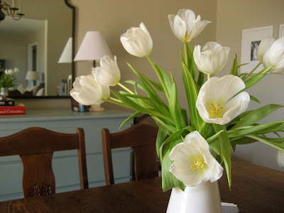
Pretty white tulips that Wes gave me on Valentine's Day. I love tulips -- they are such a trip. No matter how much time you spend arranging them, they pretty much do what they want. They also continue to grow in a vase of water, which I find so amusing.


I've been admiring these daffodils all week. They're on the gorgeous campus of Samford University, which is close to my office. I had to drive on campus to get a photo, but unfortunately, they're all facing the street! I think you get the idea. Don't be too decieved about the Alabama weather, it was only 45 degrees today, despite the sunshine and green grass in this photo.


And finally, a gratituitous picture of Maddie. She doesn't really have anything to do with spring, but she's pretty!

Wednesday, February 18, 2009

Day 599's flashback


I was going through old pictures on my laptop, and found pictures of my room in the house I lived in the last few semesters I was at Auburn. I lived on campus for most of my time in school (I was an officer in my sorority and had to live in-house, or, in-dorm, in Auburn's case), so yes, having my own room (!) in a house (!) warranted a few pictures. Some girlfriends moved into this great old house a few blocks from campus, and I jumped at the chance to sub-lease when I heard one was moving out. It was nicknamed "the castle house," for obvious reasons, and man, it was such a great house. I still fantasize about buying it and fixing up sometimes. Clearly, I need a hobby!


My room was right in the middle of the house and I think it was originally intended to be a study, as it opened to the entry hall and the side hall. It had just one tiny coat closet (the other bedrooms had walk-in closets), so my stuff was kind of all over the place (but that's nothing new, really).

The stripes on the wall were already there when I moved in. I didn't mind them at the time, but now they do seem sort of odd. I didn't really have any budget for decorating, but I was proud of what I managed to pull together. The little four-poster bed belonged to my great grandmother -- it was on loan from my sister at the time -- and I bought the blue quilt set at TJ Maxx. The Thomas Paul pillow and the mirror came from a little shop in Auburn.


The little bedside table came from Angel's Antiques, and actually belonged to a friend who was studying abroad in France at the time. I found the brass lamp in my grandmother's basement and spray painted it silver. That's a stack of Cottage Living magazines on the bottom shelf (sniff, sniff).


I found the desk and hutch on super-sale at Target one day, and they lived in boxes in Wes' basement until I moved out of the dorm. I still fully believe in buying things that are on sale/you totally love, even if you don't have a place for them quite yet! I bought the little white framed bulletin boards at Target, and then hot glued ribbon on the back. Wes thinks they're a little too girly, so I gave them to my sister.


The house had such good bones. Here's a view into the bathroom I shared. It had black and white marble tiles, and you can see that the doors had the original glass knobs. Love that.


And on the other side of the window was a built-in bookcase (another reason I think it was supposed to be a study), which was handy for storing all of my junk! Good grief at the clutter! My mom found the bow-front dresser at an antiques shop in our hometown, and I still have it (and love it) in our bedroom today.

I had so much fun looking back. I can really see how my "style" has evovled and changed and been influenced by what I do at work. How has your personal style evolved?

Tuesday, February 17, 2009

Day 598's makeover


I'm loving designer Keller Donovan's front porch makeover in House Beautiful. His ideas are universally applicable and easily replicated.


The first thing he did was take off the screen door. "I don't believe in screen doors on the front of a house. They always open out, and I just don't think it's welcoming to have a door shoved in your face as you're trying to get in," he says. Then he painted the house a nice beige (Sail Cloth by Benjamin Moore) and the front door Black Forest Green (also by Ben Moore).


He replaced a small, overhead lantern with a pair of over-sized lanterns from Home Depot.


New hardware on the door -- including a pretty ring-shaped knocker -- makes it shine. I bought paint for our front door yesterday, and we're shopping for new lanterns (and a drill bit that will work on the stripped screws holding the screen door to the house!), and I'll definitely be taking Keller's advice:

"Some people might think the lanterns are hung too low, but they're the same people who always hang pictures too high. I like a sconce down near your face. Conventional wisdom says it should be 68 inches from the middle of the fixture to the floor, but I'd still eyeball it.

I went for the "lifetime finish" on the brass hardware. Who has time to polish?

I chose a mail slot instead of a mailbox, because I can go away and the mail is all safe and sound and dry inside the house. Nobody sees it piling up.

Even a door can use a little jewelry, like a door knocker. This simple ring couldn't be more classic. Don't all the sexiest girls have hoop earrings?

A wrought-iron railing should be dark, not light. Forget the white paint."

Photos by Michael Price for House Beautiful

Monday, February 16, 2009

Day 597's answer


Right on cue, Eddie Ross has further answered my question about my black pitcher. Silly me, I was trying just a little too hard. A simple link on his blog to the ebay listings of "wedgewood basalt" produced 68 results that look a lot like my little pitcher (and the ones in this picture), and a quick Google search found this. Mystery solved!

And by the way, I love how he spray painted that once-ugly urn with matte black paint to blend with the rest of his black Jasperware! What a great idea to tide me over until we can splurge on a few more pieces.

Friday, February 13, 2009

Day 594's pretty

Photo by Lisa Hubbard for Southern Accents

However you plan to celebrate (or even if you don't) I hope you have a lovely weekend!

Happy Valentine's Day!

Thursday, February 12, 2009

Day 593's love: chests and commodes


I have a serious thing for chests and commodes (no, not toilets!). They are endlessly useful, but also quite attractive in any room. Small ones look great as bedside tables (as seen above), larger ones can even hold a television set. They look especially pretty under a mirror and accompanied by a lamp (or two).

I was browsing 1st Dibs the other day and hit the mother load of beautiful chests. Of course, local antique shops, flea markets, and probably even garage sales have plenty to offer, too (AND I could actually afford them). Painted, stained, metal -- I love them all!


Gustavian Painted Commode from the late 18th century is available through Susan Golden Antiques.


A piece like this would be a great investment. It will never go out of style, and it will probably look better as it ages. Your kids will fight over it when you're gone. French Provincial Commode at Sutter Antiques.


I love a pair of anything, and this pair of 1940's Bleached Mahogany Neoclassical-styled chests is no exception. They would look fabulous next to a bed and can you imagine all of the stuff you could cram in there?! Or maybe that's just me ...


I love the finish on this Painted Directoire Commode. Sure, it's $4,000, but it's a great look to try to copy with a less valuable piece you score for pennies (like The Stamford Wife or My Notting Hill did).


This fruitwood Italian Commode is just lovely. I think I'd put it between two chairs in a living room (I'm into this fantasy decorating lately -- very recession-friendly!).


This metal three-drawer chest is interesting and would add a sort-of industrial chic thing to a room. Mega points awarded to it's future owner for originality (Megan, I feel like you'll like this one).


And this is the chest that launched the post (and way too much time spent browsing 1st Dibs). Oh. You just can't fake that kind of patina. It's so pretty, I don't even have anything else to say, expect that you should definitely click through the detail shots (I saved all of them).

Wednesday, February 11, 2009

Day 592's quest


I was doing a little Google Image searching this morning (though now I can't remember what I was looking for!) and came across this lovely image in a story on open shelving on Habitually Chic. Since I bought the little black pitcher at Scott's last month, I've been trying to find out more about it -- it's unmarked -- and looking for similar pieces online. I haven't come up with much, which is why this little collection caught my eye. They appear to have the same chalky (Eddie Ross called it "basalt") finish as my little pitcher, so I emailed Heather in the hopes that she will know a little more about the image so I can get my hands on some resourcing information. Fingers crossed!

UPDATE: Heather says the photo is from the Elle Decor spread on fashion designer Michael Leva. The caption notes that the black dishes are Wedgwood basaltware from the 18th century. Thanks, Heather!

Tuesday, February 10, 2009

Day 591's favorite architect

Photo by Phil Mansfield for The New York Times

Several bloggers posted recently about a Greek Revival house built to look old in Dutchess County, New York (read the write-up in The New York Times and be sure to check out the slide show of interior images). Manhattan architect Gil Schafer designed his house (built in 1999) to blend in with its 150-year-old neighbors after a three-year house hunt turned up nothing but out-of-budget mansions in need of a remodel. I love this concept, and especially love that seems to be gaining popularity.

Photo from New Old House magazine

My favorite architect is Russell Versaci, whose book Creating a New Old House outlines what he calls the "Pillars of Traditional Design," a set of principles for architects and homeowners to use to create new, authentic traditional architecture.

A devout lover of old homes, his new houses are some of my all-time favorites. Especially this one, called Fall Creek Farm, in Damascus, Maryland. The main house is stone, while the addition is stucco and the guest house is clapboard, giving the impression that the house was added to over time.

In this latest book, Roots of Home, he explores the "old-world influences" that have shaped American architecture, and talks about building green with an eye to tradition.

Julie Cole Miller of Southern Accents recently asked him about his own house, and I loved what he had to say: "I live in a tiny 1740s Virginia German stone farmhouse, the original home on an old farm that now sits right on the fairway of a golf course. It’s 1,600 square feet with well-worn heart-pine floors, beamed ceilings, and cast-iron rim locks, and nothing is plumb or square. I’m in traditionalist heaven. When I moved there 10 years ago, I thought it would be a temporary roost until my fiancĂ©e and I could find a large, gracious old Southern home, or the right land on which to build. But that hasn’t happened yet, and, actually, it’s been a blessing. Our ideas of what we need and want in a house have changed a lot in the past decade."

Monday, February 9, 2009

Day 590's make believe makeover


It's been a week, and I'm still not over that pair of blue club chairs I saw in an antique store/flea mall. I hate passing up such a good deal, even though we have no need for them/place to put them/funds to recover them. So, in lieu of owning them, I'll fantasize about what I would do with them.


It's almost spring, which means I'm experiencing my annual crush on all things navy blue. Especially this fabric from Lewis & Sharon. I'm thinking it would hide dog hair like a dream, er, it would be really pretty on the chairs.


Then, I'd lighten the room up a bit with Aganthus Green by Benjamin Moore.


Between the chairs, a little painted chest is practical and pretty. And since I saved so much on the chairs and fabric, I think I can splurge at little on the chest! (Yeah, right!)


A pair of floor lamps will be perfect for reading. Antique brass, please. Add a stack of books and we're set.

Friday, February 6, 2009

Day 587's pretty idea


I found this pretty image yesterday on The Nesting Place. I love it! The plates fill the space between the bed posts so nicely -- which is no small feat. If I ever get tired of our egg prints (which is unlikely), I'd try this. I bet you could come up with a comparable group of plates and platters at TJ Maxx, Marshall's and/or HomeGoods for under $50. Of course, you might have to hire an engineer to hang them. Lucky me, I married one!

Happy Weekend!

Thursday, February 5, 2009

Day 586's pretty find


I love these white ceramics by Coe&Waito, a duo of design-school friends who bonded over a mutual desire to make beautiful and personal objects. They create these in their studio in Ontario.


Large Bowls, $120, made of slipcast porcelain with a creamy, clear glaze on the inside.


The hand-sculpted pine cones are especially charming. $150-$120 each.


The glazed interior of the Bird Bowls are applied with black bird decals. $64 for the large and $52 for the small size.


The outside of the White Vase is left unglazed. $80. Just beautiful!